Visualization
Node Visualization
When a node is run (double clicking it) its result can be rendered as a table, a pivot table, different type of graphs, or a map.
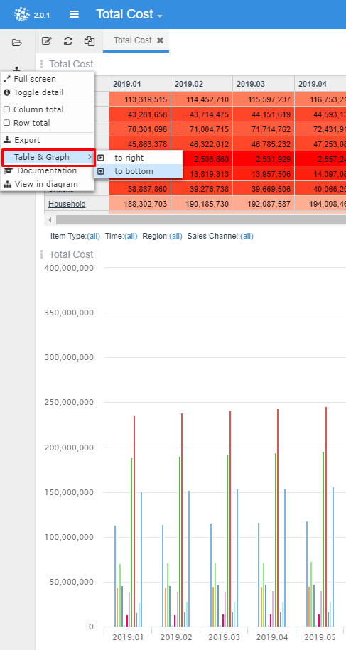
The visualization type is selected clicking on the configuration wheel that appears when you enter in the visualization edit mode. After clicking the configuration wheel the following menu is displayed to navigate and set the options.
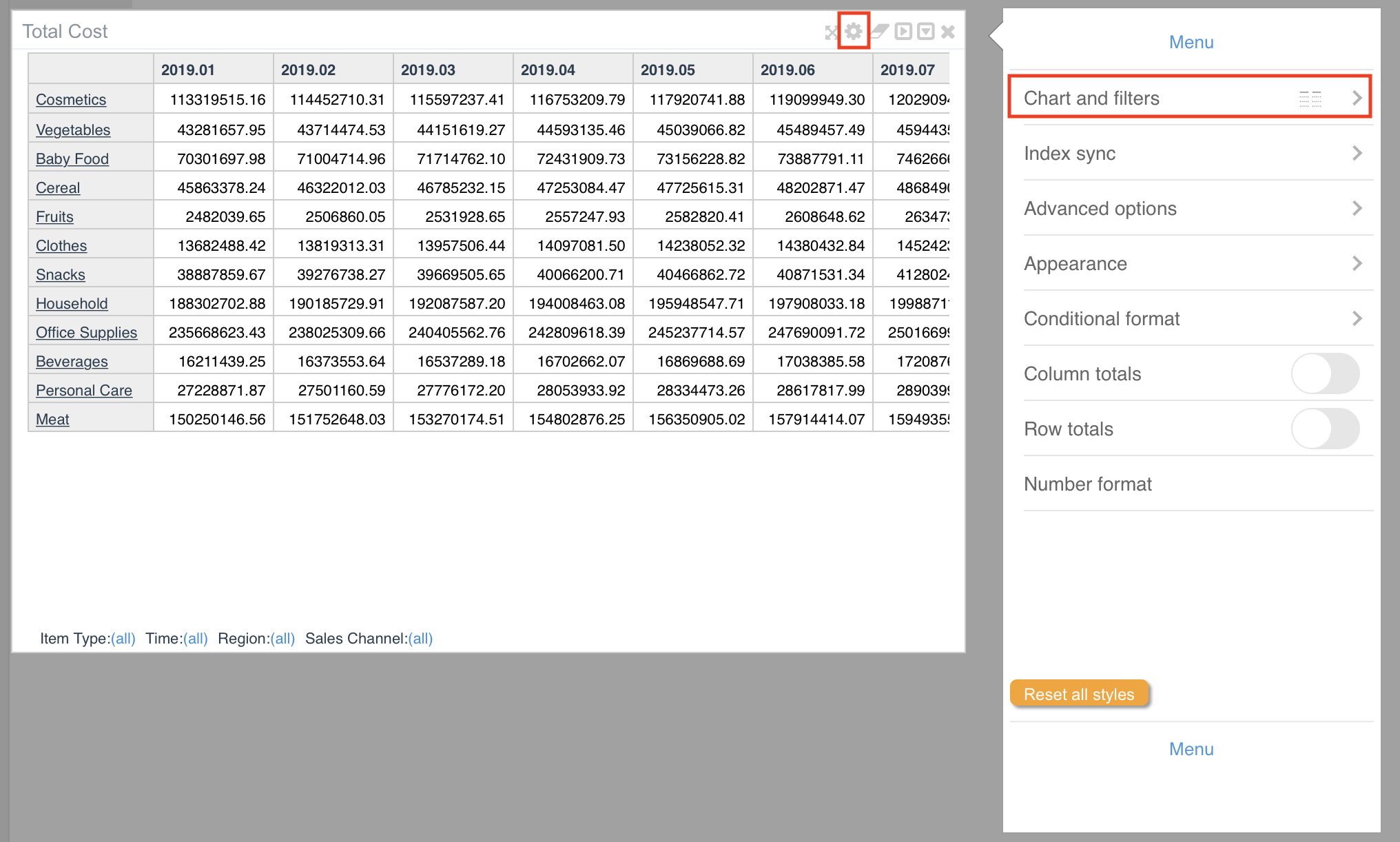
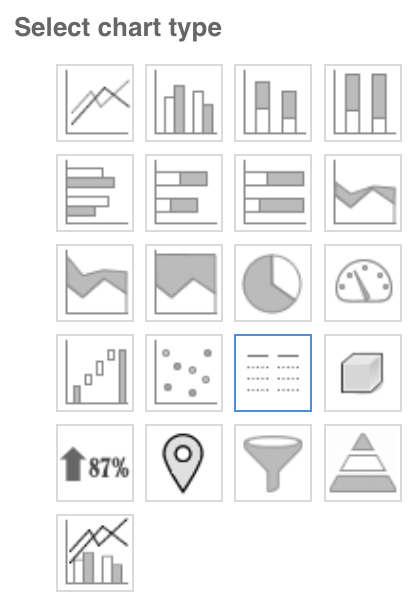
The first choice to be made is about the type of chart (Table, Graph or Map). The menu is accessed clicking on the first option called “Chart and filters”.
Tables
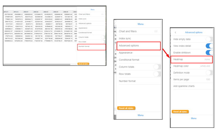
There are two types of tables intended for different purposes. Regular tables and pivot tables. The image below show some different configuration features from these tables:
Regular Table
Is the default view of any node. The user can pivot dimensions and filter any dimension by clicking the (all) legend next to each dimension.
It is possible to generate custom configurations by rows or cols. Heatmaps and Background colors based on customized ranges are also possible.
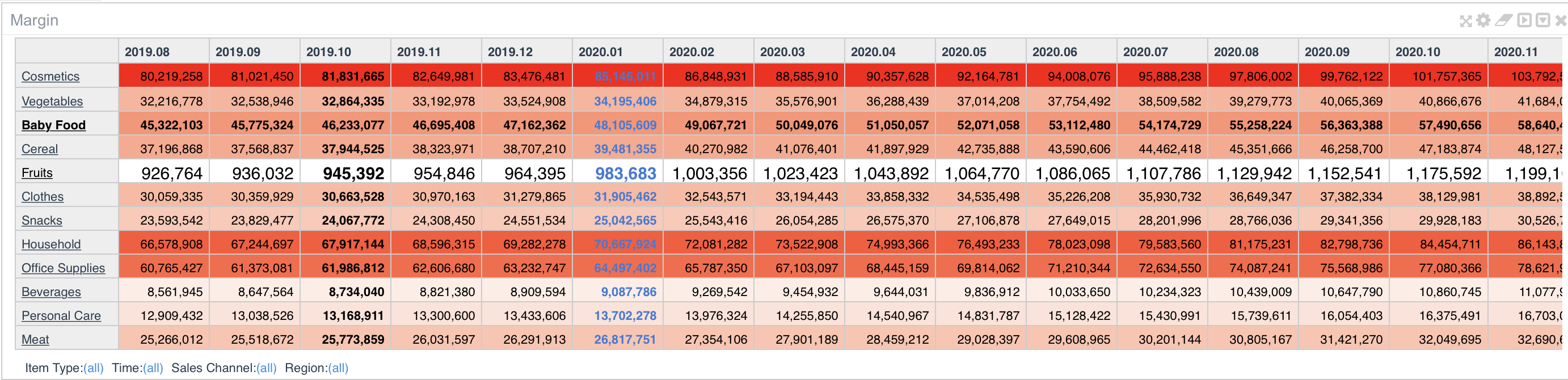
Number format menu and advanced options may help generating the view you need for each variable.
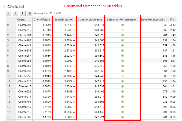
Conditional Format
Regular table has the option of defining conditional format rules to coloured, highlight with different font or even add a shape on displayed information.
These configurations enhance visualization analysis.
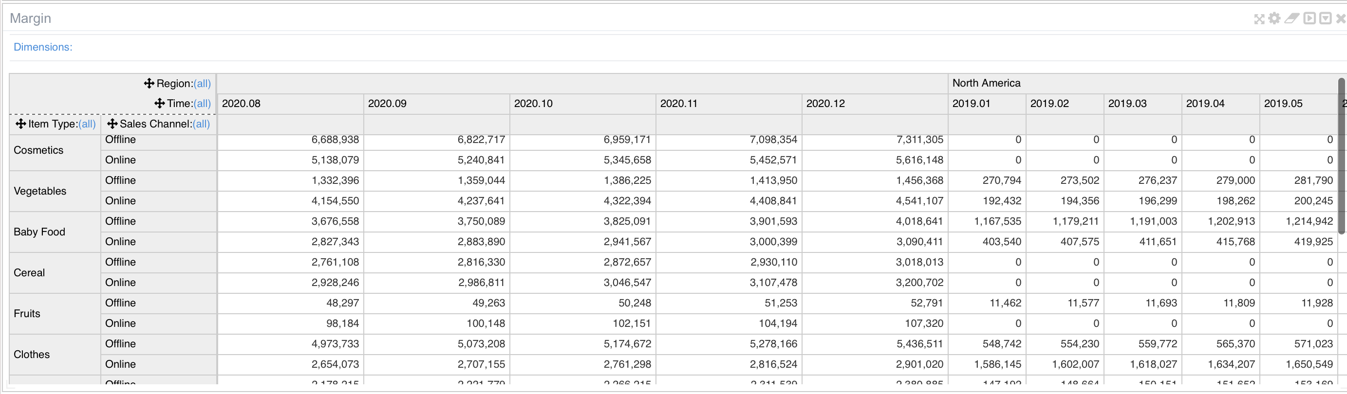
Pivot Tables
Different than the standard table It allows multiple dimensions in rows or cols as well as filtering.
It has fewer customization options compared to regular tables.
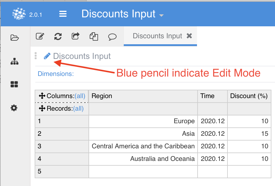
 But one main differentiation is that can work as an input table, allowing the user to manually change table values.
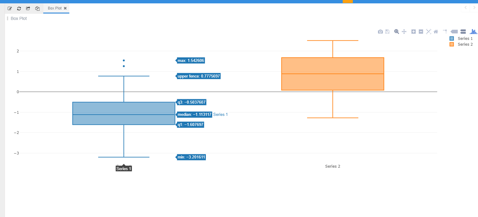
Graphs
Pyplan includes several type of standard chart graphs.
Take advantage of graph generation shortcut to create a graph in one click.
Graphs customization options are availbale on rigth menu.
Types of graphs, labels, legends, axis configurations and other characteristics can be defined on this menu. 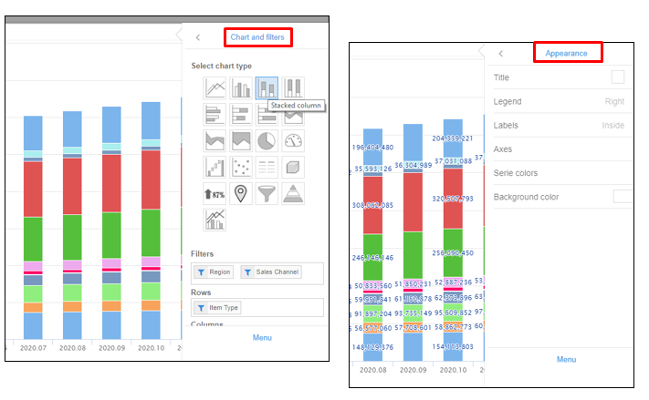
Advanced Options and Index Sync
Regular tables as well as graphs share a couple of advanced options that can be very helpful.
Click on Hide empty data, View index detail and Enable drilldown to see how these options impact on tables and graphs.
Index Sync is a powerful tool when working with tables and graphs sharing dimensions.
Pyplan synchronizes shared dimensions among objects presented in an interface.
For instance, on the following example total cost Information is presented as a table and as a graph and all dimensions are synchronised.
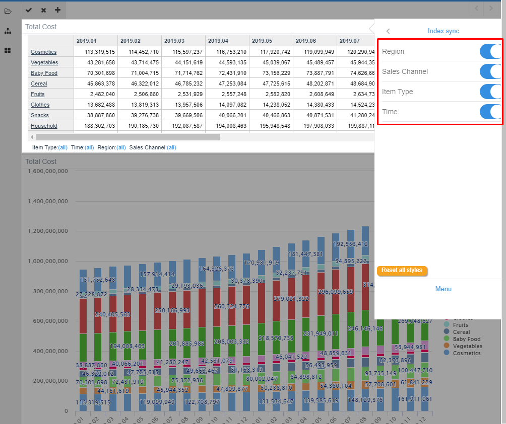
This means that any dimension filtered on the table will apply on the graph and vice versa.
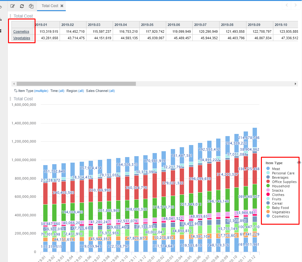
On the other hand, it may be useful to des-synchronised dimensions between objects.
Let’s suppose you need to filter some item type on table while all item type is shown on graph for doing some analysis
Des-synchronizing index Item type on the menu shown above will allow you to do this kind of selective filtering.
This characteristic will also be very useful when designing interfaces which collect information from different parts of your app when they share dimensions. Check specific section for further infomation.
Other visualization libraries
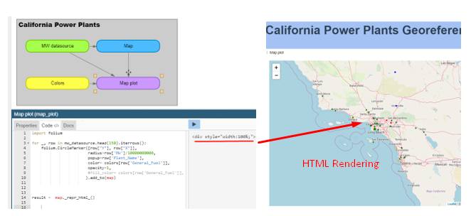
As any Python developer knows there are plenty of open source graphing libraries available on the web. Bokeh ,Plotly and Folium are examples of these libraries that can be used for plotting data.
Pyplan has the capability of interpreting and rendering HTML code generated by these libraries.
For instance, you can check the following example
Public/Examples/01-Visualization/02-California Power Plants/California Power Plants.ppl
Where HTML code is rendered getting California power plants geographical represented
Plotly graphs are interpreted by Pyplan by simplying adding result = plot(var_to_plot) at the end of the code.
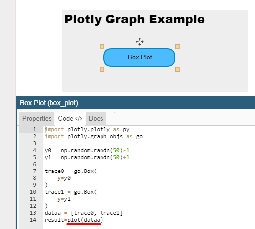
Check the folowing box plot example